
I want to start out by thanking everyone for the support and nice comments you all leave for me. I truly appreciate the support of this blog!! I enjoy card making and bringing my creations to you, this wouldn’t be possible without your support, so again, thank you!! *Affiliate links are used at no additional cost to you. When you purchase products through my links I receive a small commission from these sales, which helps me to purchase new products for the cards I share on my blog. Thank you so much for your support, it is greatly appreciated!! Don’t forget to check out my previous blog for MANY more card projects! You can find them HERE.
Today I have a card using the beautiful Flowering Vine stencil set, that I’ve stenciled onto colored cardstock. This stencil has become a favorite of mine for both white and colored cardstock and is now back in stock! Dye inks don’t have to be used on only white cardstock, by laying a base of white pigment ink onto the colored cardstock first, allows any dye ink to be seen. Stenciling or stamping on colored cardstock is such a fun technique and gives such stunning results! I will show details of how I created my card and at the end, I will have many examples showing different color combos on other colors of cardstock so don’t forget to scroll to the bottom of this blog, the results are stunning! All of the cardstock, inks, stamps and dies I use on today’s card are from Gina K Designs. Let’s get started!!

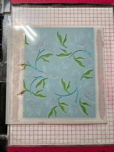
I will be doing all of my work today on my Tim Holtz Glass Media Mat.
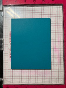
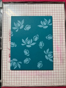
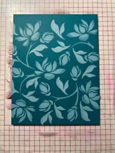
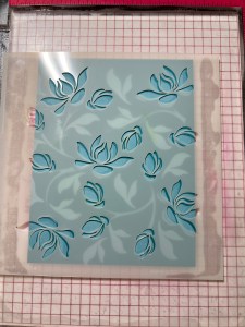
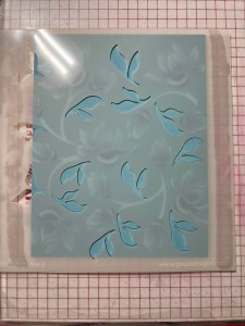
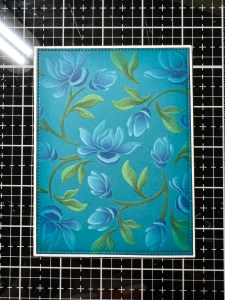
To start, I cut a 4 1/4″ x 5 1/2″ panel out of Tranquil Teal Cardstock using my Guillotine Paper Trimmer and place it onto my Grip Mat that I keep in my MISTI Stamp Positioner. I then lay the first stencil from the Flowering Vine Layering Stencil Set over my panel and press the edges down onto the Grip Mat to adhere into place. To add my base blending, I like to smoosh my White Pigment Ink pad onto my Glass Mat as I find it easier to pick up the ink.

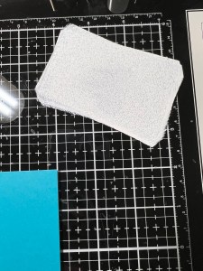
Using a Sponge Dauber I pick up some of the White Pigment Ink and add it over the stencil, working on one flower image at a time. I like to gently press and twist the dauber to add the ink into the stencil openings, this method also helps to keep the sponge from snagging the edges of the stencil. You want to be sure to lay down enough ink that the open area looks “white”, but not too much that ink seeps under the stencil, you want a thin, yet solid coverage. I then move onto the remaining areas and ink them all in the same way then remove the stencil. *I like using a sponge dauber vs a blending brush as the sponge dauber gets the job done better for me and doesn’t leave any bristle marks behind. **To clean my stencils, I spray them with isopropyl alcohol and clean them off with a dry cloth, making sure to clean both sides of the stencil.

Next, I line up and adhere down the second stencil and again, use my Sponge Dauber to apply another layer of White Pigment Ink over all of the open areas of the stencil. I then remove the stencil.

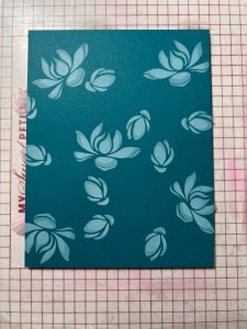
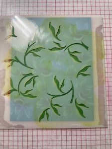
I now line up and adhere down my third stencil, which is actually the #4 stencil from the set. (All of Gina’s stencils are etched and numbered on the lower edge of each stencil, in this case 1 – 4) I again take my Sponge Dauber and apply a thin, yet solid layer of White Pigment Ink over all of the openings of the stencil then remove the stencil. *You can use the stencils in the intended order 1-4, however, I found it easier when creating my pigment ink base to switch #3 and #4 around to line up the stems to the flowers. Later, when I add my dye ink I will use them in the intended order.

Finally, I place the final stencil (which is the numbered 3 stencil) and adhere it over my panel, making sure it is lined up properly and blend White Pigment Ink over the open areas of the stencil. I then remove the stencil and this completes my creating the base for my colored dye inks. Using my Heat It Tool, I heat set and dry the panel, making sure all of the pigment ink is completely dried before moving onto the dye inks. *It is important to completely dry the pigment ink before applying the dye ink so you don’t transfer the pigment onto your blending brush then onto your dye ink pads.
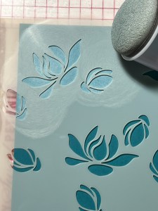
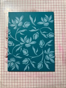
It’s now time to add some color to my panel. I start with stencil #1 and adhere it down, slightly offset to achieve a bit of a shadow effect to the image. Switching to my Blending Brush, I blend Ocean Mist Ink over all open areas of the stencil. *This is a very light colored ink over the white pigment, so the shadow effects aren’t as prominent. You can see the effect more so on the example panels at the end of the blog. I remove the stencil and move onto the next color.
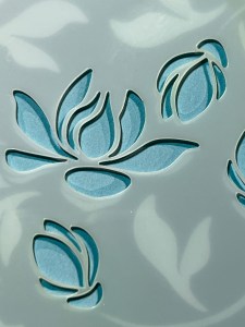
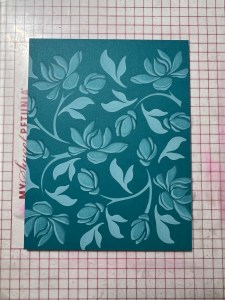
Taking stencil #2, I line it up and adhere it down. Using my Blending Brush, I blend Turquoise Sea Ink over the open areas of the stencil. Leaving the stencil still in place, I use my Mini Blending Brush and blend Blue Denim Ink to just the base of the flower. I repeat this with the remaining flowers and buds then remove the stencil.
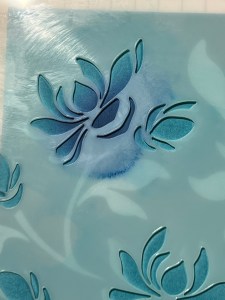

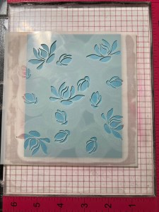
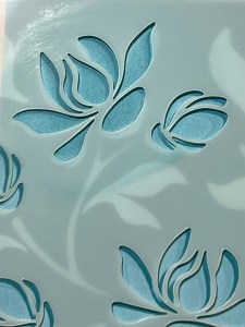
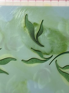
Next, I take stencil #3, line it up and adhere it down. I then use my Blending Brush to blend Jelly Bean Ink over all of the leaves on the stencil. I should have shifted the stencil a bit before blending to add the shadow effect, but I forgot to. After blending all areas, I remove the stencil.
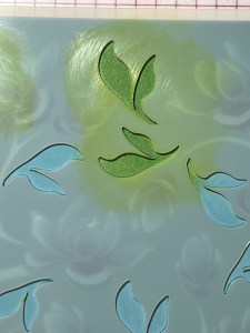
For my final blend, I line up and adhere down stencil #4. Using my Blending Brush, I blend the same Jelly Bean Ink, this time a little heavier over the stencil. Leaving the stencil still in place, I take my Mini Blending Brush and blend Fresh Asparagus Ink to the stems and base of the leaves. Now that all of my blending is complete, I remove the stencil. Look at those beautiful colors on the colored cardstock!

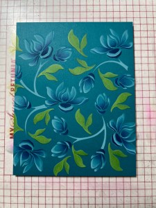
Taking the large stitched rectangle from the Master Layouts 14 Die Set, I cut down my panel, running them through my Platinum 6 Die Cut Machine. To add some shading to my panel, I take my Blending Brushes and blend Tranquil Teal Ink around all sides and corners. To add further depth, I blend Blue Denim Ink to the very edges of the panel. This blending isn’t drastic, but adds just enough contrast to give a finished look.

Next, I take the largest layering die from the Master Layouts 1 Die Set and cut out of White Cardstock, running them through my P6. Using Liquid Glue, I adhere the two panels together and mount them onto a Jelly Bean Green Cardstock card base.
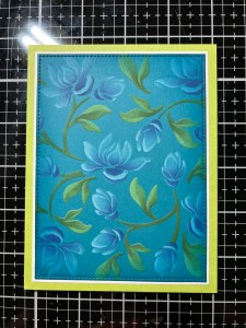
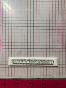
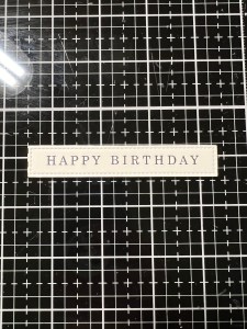
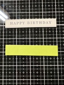
For my sentiment, I take the smaller stitched strip die from the Master Layouts 14 Die Set and cut out of White Cardstock, running them through my P6. Placing the sentiment strip onto my Grip Mat in my MISTI, I line up a sentiment from the Flowing Florals Stamp Set and stamp it using Black Onyx Ink.
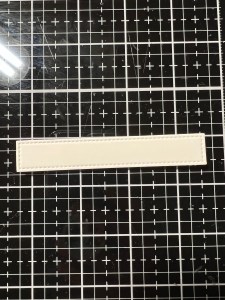
Next, I take the smaller layering sentiment strip from the same Master Layouts 14 Die Set and cut out of Jelly Bean Cardstock, running them through my P6. Using Liquid Glue, I adhere the two strips together, then glue them onto my card front.

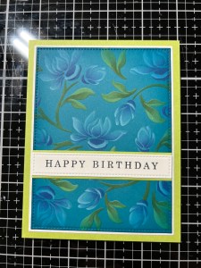
Using my Pick & Stick Tool, I add Dew Drops with Liquid Glue and this completes my card.
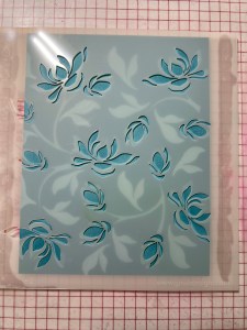
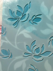
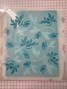
Here are the bonus panels I created using different colors of cardstocks and inks. Just to warn you, once you start creating these panels your mind starts to wonder what “this” color or “that” color would look like and soon you have a pile of panels… you just can’t stop yourself!! Let me know in the comments below, which panel is your favorite!

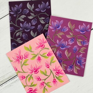
I hope you enjoyed today’s card and learned how beautiful it can be stamping on colored cardstock! I had so much fun creating these panels and had a hard time deciding which panel to use for my card. All of these panels would be perfect for this type of card and I now have several to turn into quick cards for my future needs. There are several sentiments included in the Flowing Flowers stamp set I used, that are the perfect size to use with the sentiment strips included in the Master Layouts 14 die set. This die set is perfect for using on those beautiful backgrounds that you hate to cover up! Though I used layering stencils on today’s card, stamps also work great for stamping dye inks onto colored cardstock. Always remember to lay down white pigment ink before stamping with dye inks. Such a fun technique, I hope you give it a try!!
If this is your first time visiting my blog, welcome and I hope you return. If you are a returning visitor, thank you so much for your support!
If you would like to be notified by email each time I post a new project, there is an option to add your email (located at the top menu, or on the right side of my page) then hit the subscribe button. Should you have any questions or comments please leave them in the comments section. I’d love to hear from you and what you thought about today’s card.
Thank you for visiting and I hope you come back soon!
Happy Stamping and God Bless!!
Jeannie

These are just gorgeous! Love the diversity in color and backgrounds. Will definitely try this. So many possibilities! Thanks for sharing this.
LikeLike
Thank you so much, Gail!! They are so fun to make with so many beautiful ink color choices and cardstocks!
LikeLike
Great technique and excellent instructions with illustrations.
LikeLiked by 1 person
Thank you so much, Sue!!
LikeLike
Wow! This is stunningly beautiful!
LikeLike
Thank you so much, Joanne!!
LikeLike
These are such pretty examples! Thanks for detailing the instructions, and I admit I wouldn’t have thought to add white first.
LikeLike
Thank you so much!! Such a fun technique!
LikeLike
Gorgeous card and bases!! I can’t wait to try this technique!!
LikeLike
Thank you so much, Coleen!! They are so fun to make, have fun!
LikeLike
I have always admired this technique, but have never actually tried it. Your examples are quite pretty and encourage me to finally give this technique a try.
LikeLike
Thank you so much for your kind words, Ruth! Please, do give this technique a try… you will be AMAZED!! Have fun!
LikeLike
Beautiful card and the panels are amazing too. Love this technique. I am most partial to anything purple but all are beautiful. Thank you for sharing your talent with us.
LikeLike
Thank you so much for your kind word, Annette! I too am partial to purple, it’s my favorite color. I had a hard time deciding which panel to go with. I decided to go with the teals as Tranquil Teal is one of my favorite cardstock colors!
LikeLike
beautiful cards and great instructions. My favorite is the original blue and green but next I like the black and purple.
LikeLike
Thank you so much, Debbie!! That panel has been a lot of people’s favorite… it is actually a deep eggplant background and is very rich in color. Thank you for visiting my blog!
LikeLike
all I can say is beautiful. Wow I’m floored. Great work
LikeLike
Thank you so much, Lucia for your kind words and for visiting my blog!!
LikeLike
I did this today with your perfect instructions! I love it so much I can’t wait to try other color combos. Thank you for creating such a beautiful card and sharing your instructions.
LikeLike
Thank you so much for your kind words, Cindy! I’m so happy you gave it a try… It is rather addicting when you think of more colors to try out! Have fun creating!!
LikeLike
I love the one on black. Can you share your colours. Thanks
LikeLike
Hello, Kimberly! The darkest panel is actually Edible Eggplant cardstock from Gina K Designs, a lot of people have thought it was black. The inks I used… I first blended Plum Punch ink over the previously blended white pigment ink (after it was completely dried) using the first stencil. I then blended Edible Eggplant ink over the second stencil, followed by Black Onyx ink to the very base of the images for a little depth and contrast. For the vines and leaves, I used Light Spruce, Medium Spruce and Dark Spruce inks in the same manner, all from Gina K Designs. I hope this helps answer your question. Thank you for visiting my blog!!
LikeLike
I saw this on scrapbook.com and thought “how beautiful”! Thanks for posting your blog there and offering the detailed instructions. I can’t wait to try this! They are all so lovely, but I am partial to the teal design. I love the yellow, too. So cheerful. Which yellow inks did you use for that one, if you don’t mind sharing.
LikeLike
Hello, Virginia! Thank you for visiting my blog and for your sweet comments. For the yellow blend, I believe I used a light blend of Lemon Drop over the white pigment ink with the first stencil, then used Wild Dandelion over the second stencil. All inks are from Gina K Designs.
LikeLike
Thank You!
LikeLike